
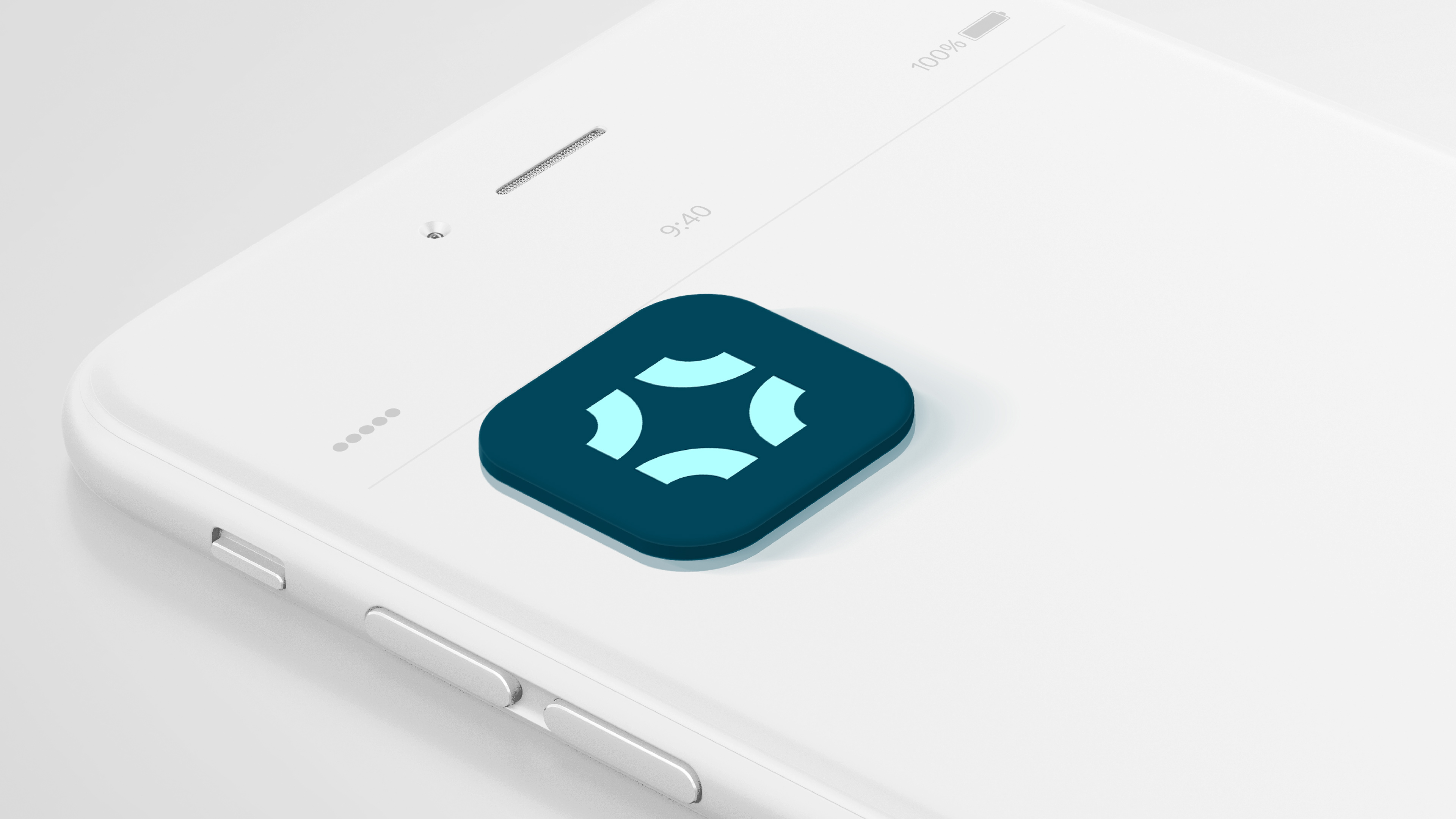
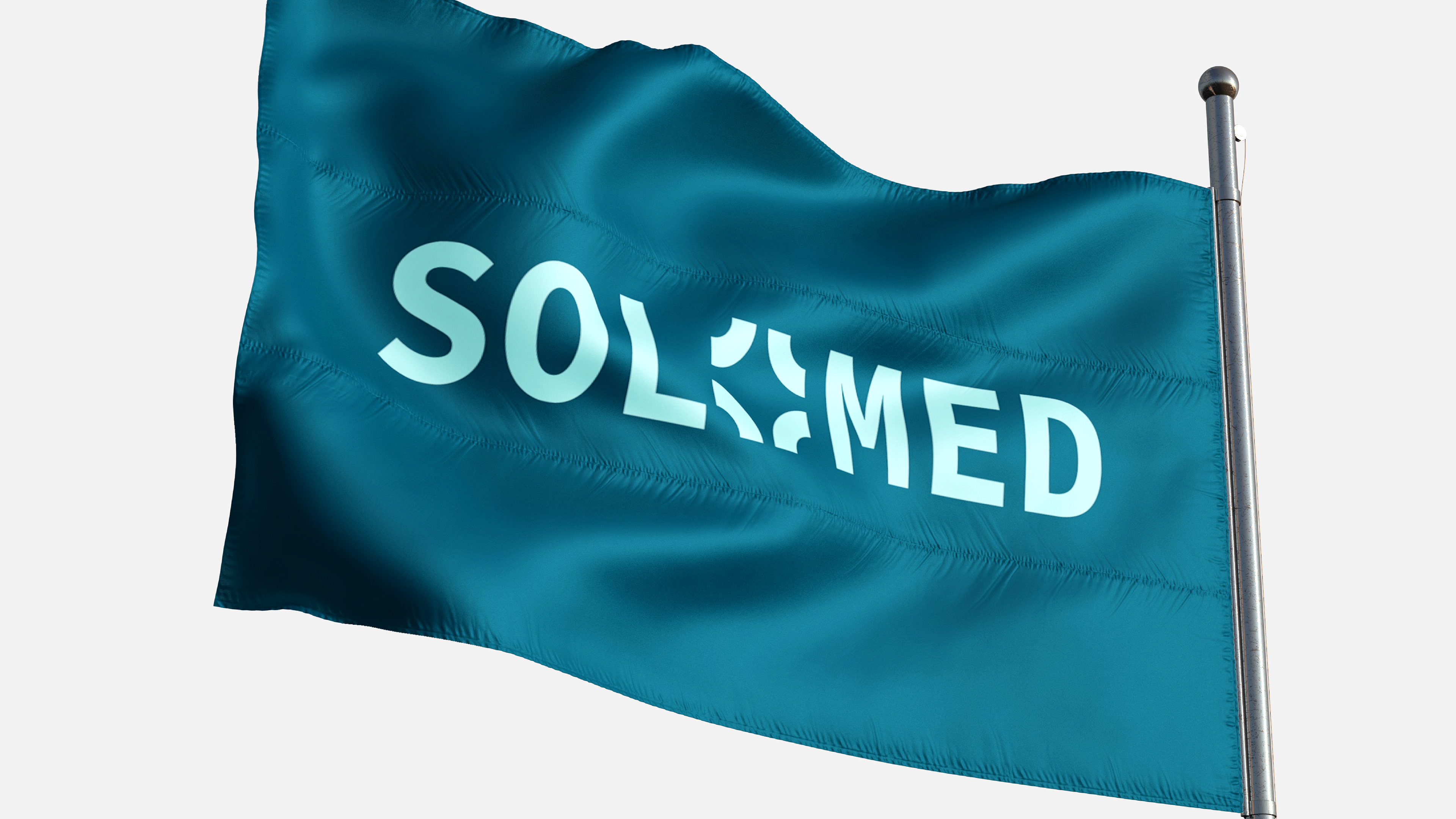
Solomed is a medical clinic brand built around a clear idea — precision in care. The icon is drawn from the focus symbol, four corners converging on a point. It speaks directly to what a clinic does: detect, examine, treat.

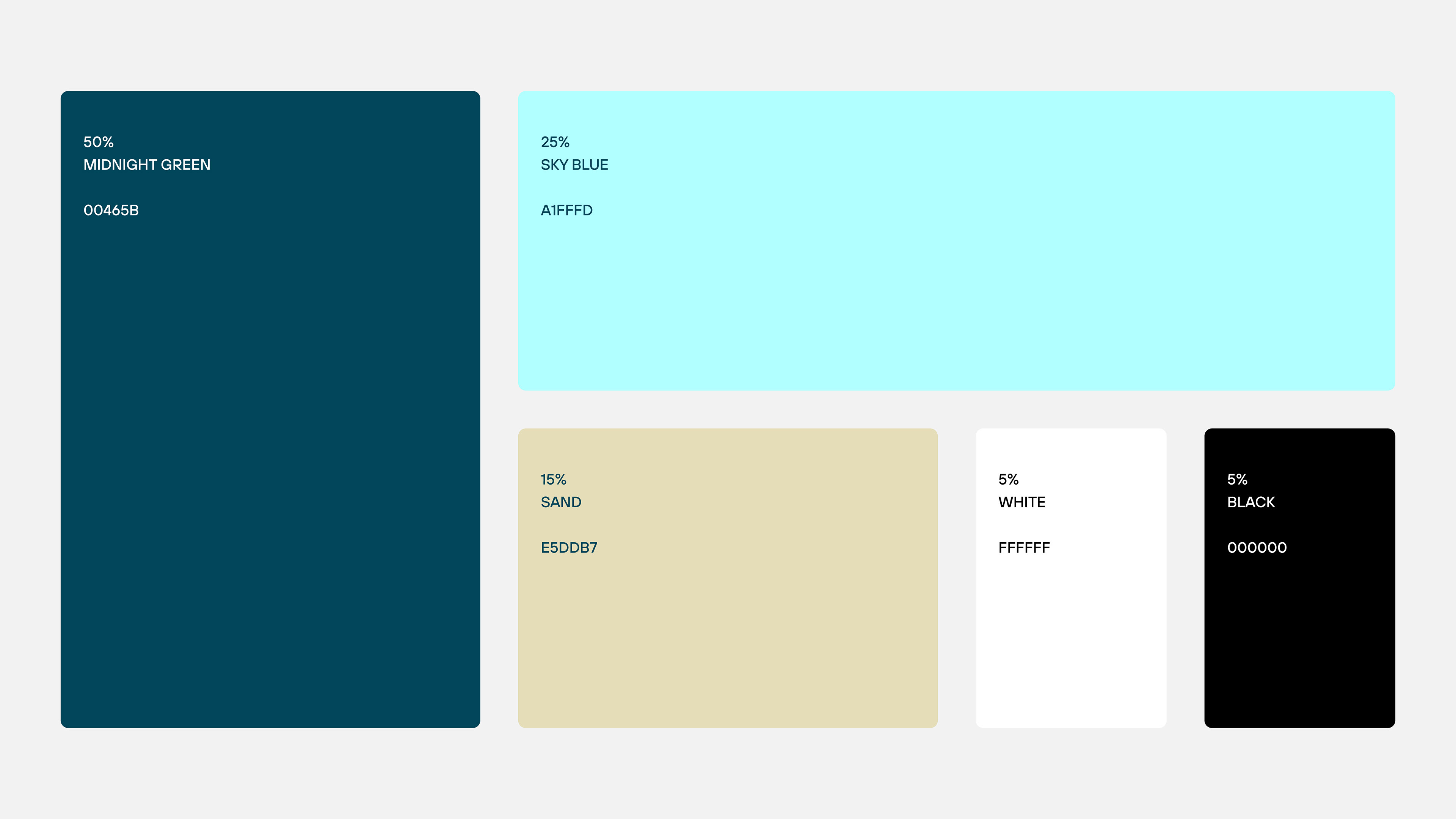
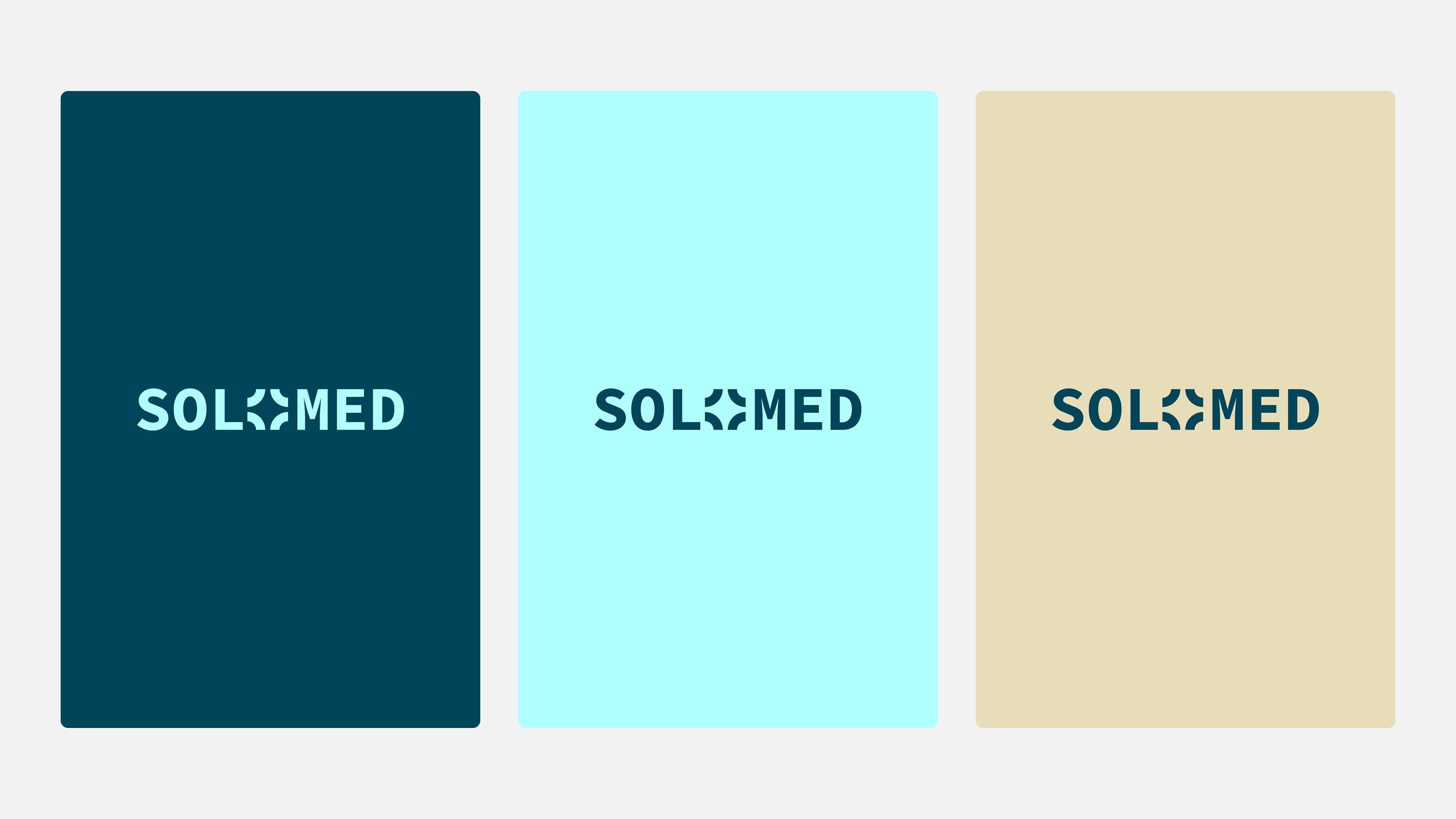
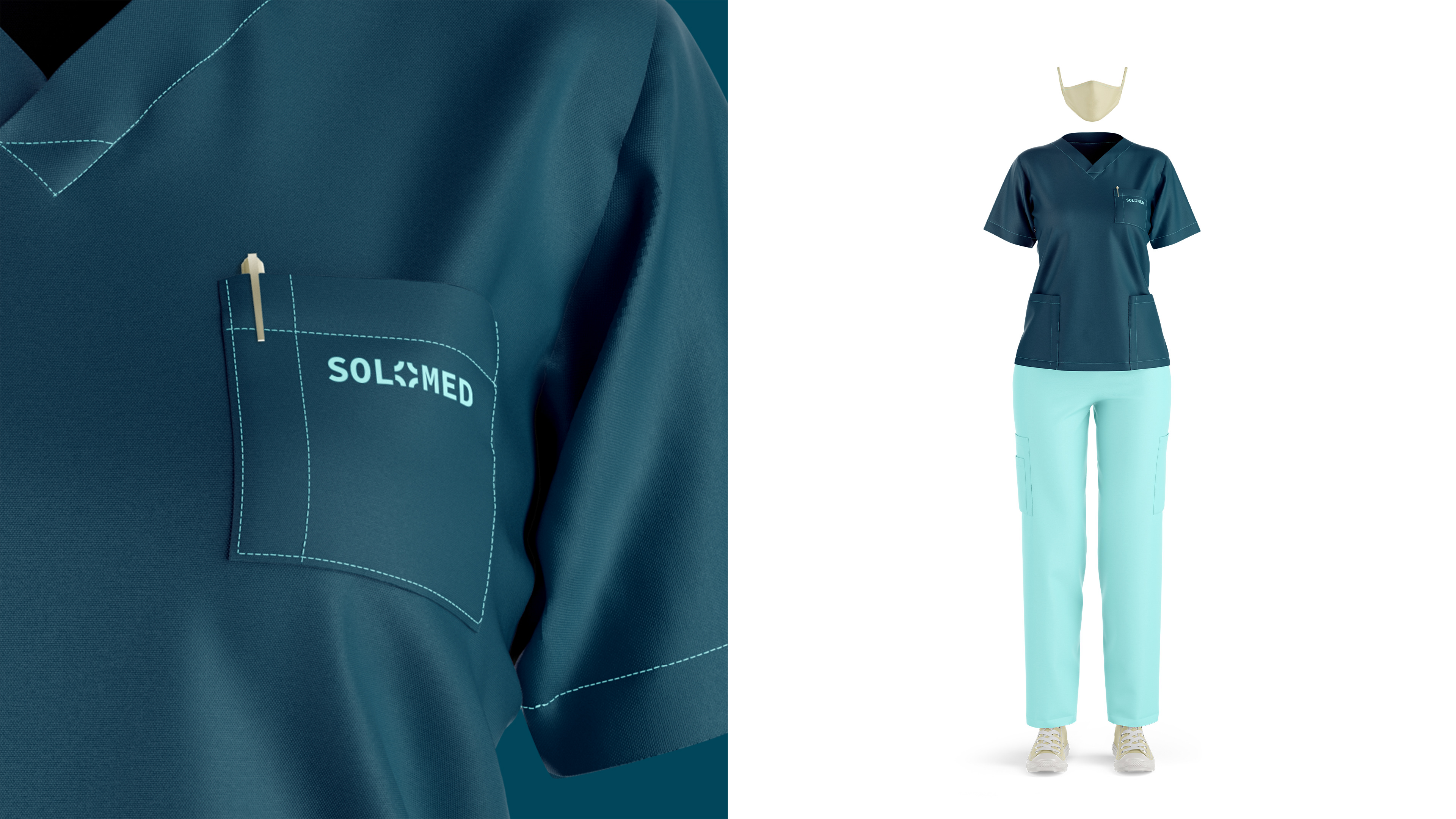
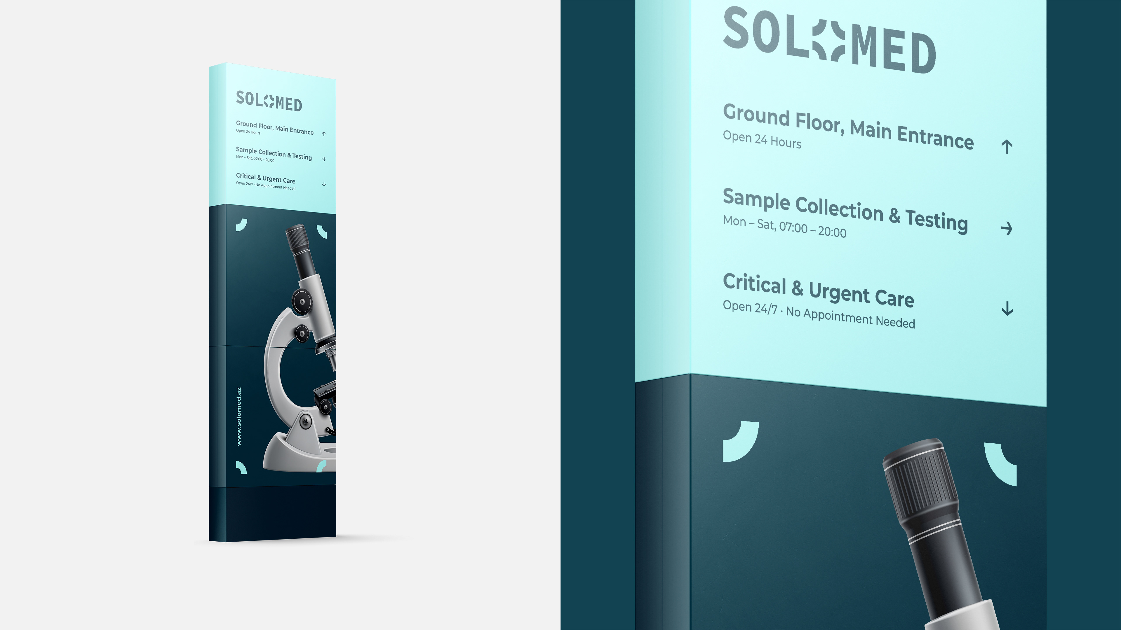
That same mark travels across the entire identity. On signage, stationery, environmental design — the four elements appear as a framing device, bringing consistency without rigidity. The deep teal grounds the brand in trust and professionalism, while keeping it far from the cold, sterile aesthetic that medical branding so often defaults to.
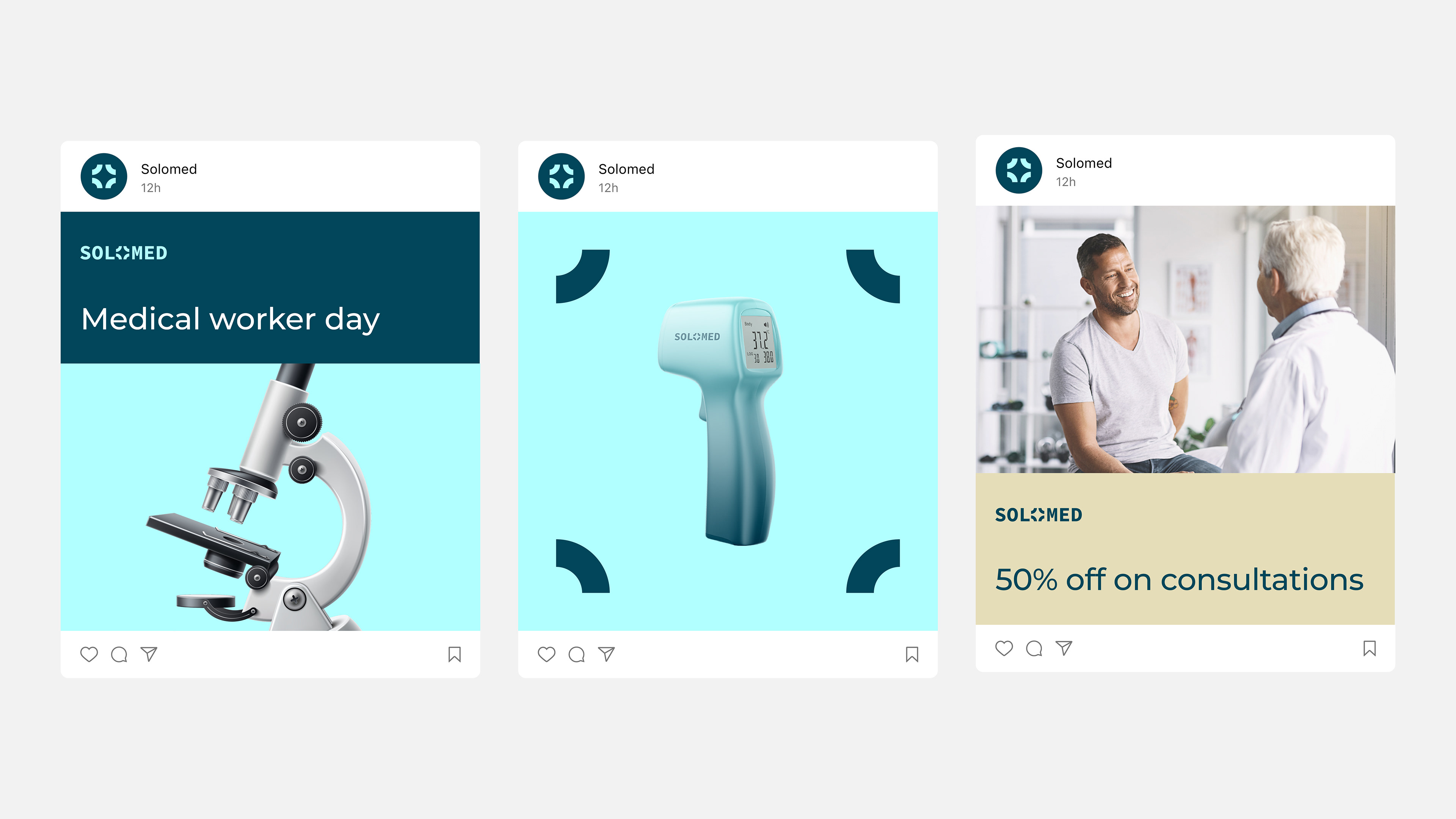
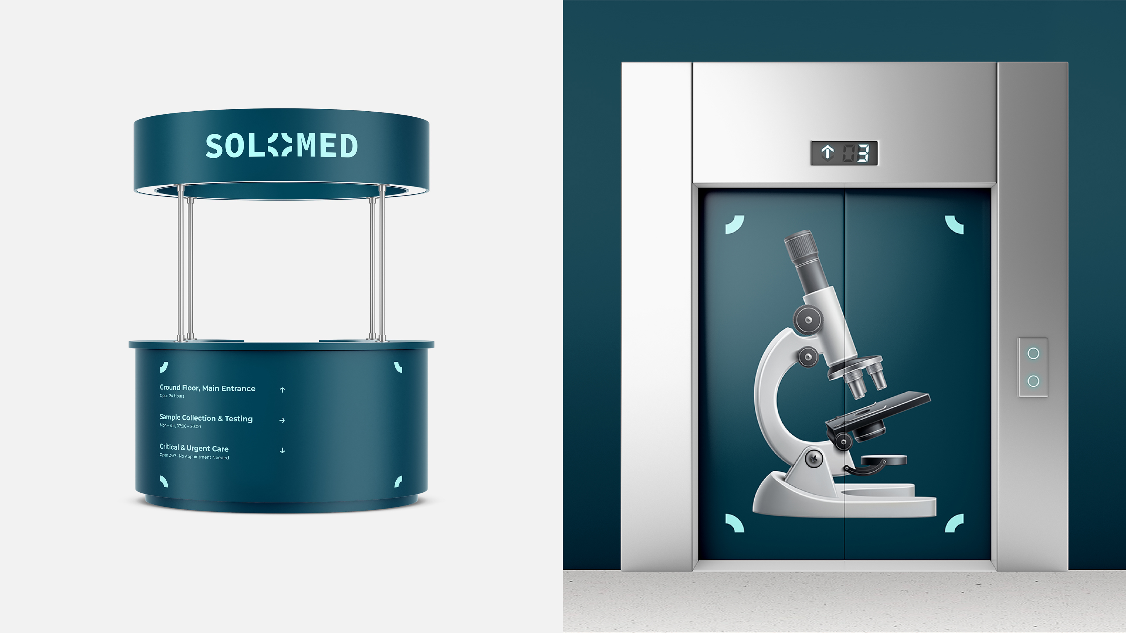
Focused by nature. Thorough by design.
Art Director & Brand Designer: Talat Ali
Creative Director: Agarajab Jafar
Agency: BHB Strategic & Creative Co
Creative Director: Agarajab Jafar
Agency: BHB Strategic & Creative Co